
Lines are fundamental to your layout’s composition. They connect points, divide space, create borders and shapes. Learn how to establish the visual structure and reinforce the conceptual design of an application with lines.
Lines are one of the most basic elements we work with in layouts. Our minds only need the merest hint of a division to suggest a spatial relationship between two parts. All it takes is a simple, thin line on a screen and our brains do the rest.
Lines can connect two points, outline shapes, group objects, or be used to divide space in various ways. Lines guide the eye where to look, they delineate (see what I did there?) what’s important, and generally lend structure to the visual design.
We use lines to establish the application area, for field borders, for dividing the layout into different zones, and for visually grouping buttons or objects.
1. Creating Lines
In FileMaker, we can create solid, dashed, or dotted lines of any colour or thickness. In the Appearance tab of the Inspector in Layout mode, we can vary the options of any line (or the line option of any object). You can create thin lines (“hairlines”) or thick lines (“rules”), and everything in between. If you create a very thick line, you might want to compensate for its visual weight by lightening its colour.
2. Grids
Grids are one of a designer’s most useful layout tools. The FileMaker grid is simply a set of lines spaced at a predetermined distance you choose in Layout mode that helps you place your layout objects. Grids deserve their own article, but in short, grids provide a foundation on which you can build the visual and logical structure of your layouts.
Working with a grid helps you distribute elements evenly throughout a layout, and avoid the problem of elements crowding each other. It gives you a reference point for lining things up. It naturally suggests where whitespace should go, and lends cohesion and consistency when you use the same grid spacing on different layouts, even if the layout itself is organized differently.
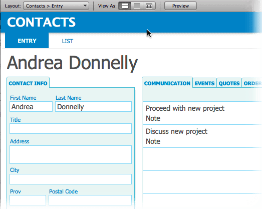
FileMaker gives you the ability to define a grid with major and minor divisions quite easily. In this design, the major grid spacing is 48 pts and the minor grid steps are 6 pts. You can work with whatever spacing feels comfortable and makes sense to you given the design.
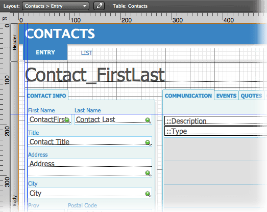
Here’s the same layout in Browse mode:
3. Dividing/Grouping
Lines aren’t the only way to define space, but they are one of the simplest and most effective. Simple lines, in a slightly darker shade than the background colour, are an easy and useful way to divide one area from another.
High-contrast or very thick lines can look heavy, and attract attention away from the display of important information, but it does depend on the visual style you’re using. They are probably most effective at the top of the layout, to reinforce the structure and hierarchy of the page.
If lines divide an area, they also create relationships in areas that are not divided, so place your lines carefully. Make sure that things that appear related actually go together from a conceptual point of view.
4. Drawing Lines
In art, lines are used to establish perspective. But in FileMaker, as in most application design, we don’t use a lot of perspective, except to hint at it. This makes things simpler.
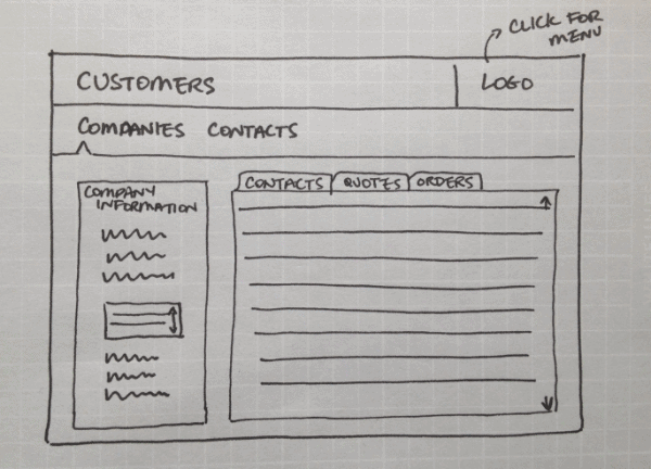
In the early stages, lines might be the only element you put down on paper to roughly describe the design. That’s one reason you don’t really need drawing skills to create a paper design, because almost everyone can draw simple lines to convey their intention with at least some degree of success.
In FileMaker design we mostly use straight lines and simple shapes. The ones you draw don’t have to be perfectly straight, just straight enough. Don’t bother using a ruler, although angling the paper away from your body might help you draw straighter lines. Experiment with what angle works best for you. Drawing the end points first and then connecting the two points with a line also helps.
This rough design was done on Whitelines paper.
5. Borders
A layout might look lost without a border, but too many borders create visual clutter. Since the human eye is very sensitive and has no choice but to interpret each line it sees, every line you add creates a cognitive load for the user.
Keep in mind that the FileMaker window itself is made of lines, within the confines of the screen. You might be able to use its borders rather than adding your own, in order to lighten the load while still anchoring the space.
If you don’t have any borders at all, though, your layout can look formless and confused. It may be more difficult for the user to determine where one area ends and another begins.
6. Minimalism
With the rise of more minimalist interfaces, there’s been a move away from using a lot of lines in layouts. Lines can be actual line objects, but they can also be text, a row of buttons, or colour blocks. These can have some of the same functions as an actual line, without the extra visual weight.
If there are very few elements on the screen, as is sometimes done in minimalistic designs, then the designer is depending more heavily on the user to either know or figure out how to use it. A very minimalistic design might be only a couple of lines and some text, or just text and a couple of icons. This works best in scenarios where the user’s goal is very clear and there are few decision points (or the user is highly motivated!).
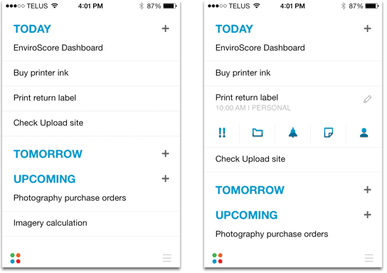
This can be most effective on the mobile platform, where screens are smaller and space is at a premium. A great example of this is Any.Do, a task and to-do list manager for iPhone and Android.
7. Structure
One of the fundamental purposes of design is to simplify reality for the user. In order to do that, application designers use visual elements such as lines to help establish an obvious hierarchy of elements. When the hierarchy closely matches users’ expectations of the application, it’s easier for them to make sense of it.
If the designer adds too many elements (lines or other objects), the application can become more complicated than the reality it’s supposed to simplify, and is perhaps…well, less useful. Occasionally I use Excel or Powerpoint, and find the collection of tools, buttons, and options somewhat overwhelming.
See how and where lines have been placed in applications you already use. Are they thick or thin? Heavy or light? How many divisions are there? Is negative space, the data or text itself creating the lines you see? Do the lines support the logical structure of the application?
8. Regularity
We prefer lines to be arranged in a regular, predictable pattern. Think how text is arranged in lines so we can read it easily. Whenever possible, make sure to line up text baselines in different columns. Your layout will instantly look more organized and pleasing to look at. Using a grid means lining fields and labels is a cinch.
Since we read left to right, we prefer a strong left alignment for objects on a layout. Make sure the elements are lined up along their left edges. If possible, also align right object edges (sometimes this isn’t feasible, and that’s okay).
Look at the space between objects, but also between the edges of objects and the edges of the layout on both sides. The more evenly spaced and regular, the more pleasing to the eye. If there is a border around the layout, ideally it should be the same distance all the way around (at least left and right should match as they are easily compared).
9. Negative space
“Lines” can be created by the spaces between objects as well as the objects themselves. Think of the gutter between two columns of text, for instance. The lines are implied, rather than explicitly drawn. But beware of removing too many lines, though, as the layout can end up looking formless and confusing. (I find the new Outlook web app suffers from this.)
If you draw a line close to the edge of a layout, you create a negative space beyond it which is itself another type of line. This is especially noticeable in small, modal windows. Everything you put on a layout gets interpreted by the eye, including the “space” you create at the edges of layouts.
In the iPhone Camera Roll, and on Facebook, white lines are used to divide pictures on a grid. It provides a crisp, clear division between the elements, which can be any colour, but are more likely to be darker than lighter. Think about how you might use light instead of dark lines as division markers.
10. Anchoring
Object anchors help lines to adapt to the size of a screen by auto-resizing them if the screen size (or rotation on FileMaker Go) changes. If you anchor an object both left and right, or top and bottom, FileMaker draws your connecting lines for you, making your solution elegant, predictable and responsive at different screen sizes.
If you plan carefully, all the layout lines should expand and contract, maintaining the logical divisions at whatever screen size the user chooses. (It would be nice if we could also distribute the space evenly between layout objects…maybe in a future version of FileMaker!)
Conclusion
Lines want to breathe. Don’t try to force too many of them together. A balanced layout has a mix of objects, lines, and whitespace. Enough to define the parts, not so much that the layout looks cluttered and busy.
Lines are so basic as to be almost forgotten about. Still, when we speak about “horizontal” and “vertical,” we’re basing our perception on line direction. How can you use lines better in your layout designs?
Is there something you want to add about lines? Comment and let me know!
Thanks for sharing your thoughts. Any FileMaker articles on user experience from a creative perspective are most welcome.
Thank you for reading!
I commend you. That was a nice, comprehensive article on lines & basics of design. It is so important for us to make our programs appealing and visually harmonious as well as attend to the data, it’s hierarchy of importance, and step by step placement. Our users have to live in the world we create. They spend hours gazing at our screens.
I wonder… as WebDirect is taxed by graphics brought in from other programs, and we are called on to utilize the tools that FileMaker gives us to recreate those graphical elements, would designing icons using FileMaker’s lines, ellipses, and rectangles, etc. possibly be a platform for one of your articles? (you did ask for suggestions)
Thanks for your comment! I’m not positive, but it might be that using FileMaker objects to create icons would place a greater load on the CSS, as every object you place on the layout is described there. .png graphics are quite lightweight. For sure, optimizing your images and using images carefully becomes important to maintain fast load times.
Great article; very clear and succinct.
Thanks!
Thanks for reading!