
Part of a series on the basics of composing layouts for an appealing UI. As visual creatures, humans are very sensitive to detecting the shapes of things we see. Interpreting shapes is one of the basic ways we navigate the world around us.
It seems beyond self-evident that every object, real or imagined, has a shape. We define objects by their shape. (Um, thanks…tell us something we don’t know.) But if we dig a little deeper into this obvious statement, we discover that shape has a profound impact on our interpretation, observation, and interaction with the objects in our surroundings.
Let’s consider the shape of the letters in the alphabet, for instance. For thousands of years, human knowledge was passed on verbally. Then, about 3200 BC, someone came up with the idea to develop shapes to represent the sounds of language and write them down. Our modern alphabet is handed down to us through the Romans and Greeks from the Phoenicians of 1,600 BC.
Today most of us take the ability to decode the shape of letters for granted—almost every first-grader can recite you the alphabet. The impact of reading and writing on human history is incalculable, though. Books, the recording of scientific research, notes from your mother, the Internet—all are dependent on people being able to recognize letter shapes and understand them.
Or think of the shape of a tool such as a hammer: there are differently-shaped hammers for different jobs. The size of the hammer’s head, the length of the handle, the weight and balance of it are all variables. Designers experiment with modifying the shape of an object to obtain different results, depending on the situation. The shape it finally takes is one that the designer has discovered is optimized (or at least satisfactory) for accomplishing the job at hand.
So it is in software design. We play with the shapes on the screen, rearranging them until we find the best fit between the user’s goals and our technical capabilities.
1. Perception
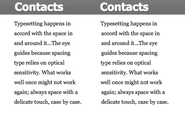
We are wired to recognize shapes. Everything we call a “shape” has a closed contour or outline, a boundary defining and separating it from its surroundings. Shape is inextricable from the space in which it exists. In Design Elements: A Graphic Style Manual, Tim Samara says, “Space is the ‘ground’ in which form becomes a ‘figure.’ The relationship between form and space, or figure and ground, is complementary and mutually dependent; it’s impossible to alter one and not the other.”
The geon theory of object recognition, also known as the recognition-by-components theory, suggests that humans recognize objects by perceiving their underlying basic shapes (of which there are fewer than 40). We do this by looking for edges, and the places where they meet (i.e. where one basic shape ends and another begins). Once we have the basic shapes worked out, we compare the object to other objects in our memory to figure out what it is. Using well-defined, basic shapes in a design taps into this innate human ability to detect shapes and edges, and makes interfaces easier to use.

Little Prince illustration from original version of “Le Petit Prince”: Copyright 1943 by Harcourt Brace & Company, renewed 1971 by Consuelo de Saint-Exupéry.
2. Pattern
As the designer, you can set up internally consistent conventions for using certain recognizable shapes, like buttons, field labels and borders, tab borders, and navigational objects. Users quickly learn that a particular shape “means” something in the context of your system, and this helps them as they interact with the program.
A series of repeated shapes creates a pattern. Closely related to shape recognition, humans are also hardwired to recognize the patterns around us. When you arrange shapes in a group or series, especially similar shapes, our brains try to see a pattern, even if none intentionally exists. Once we detect a pattern, we try to figure out what it means (i.e. what real-world concepts it’s associated with in our memory).
So it’s worth looking at your layout and evaluating the shapes, making sure that any patterns you have created are linked to the logical structure of the page, and have a consistent meaning. A disconnect between the organization of the content and the visual patterns on the page creates unnecessary work and possibly confusion for the user.
 3. Types of Shapes
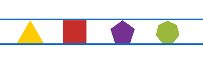
There are three basic categories of shapes: geometric, natural (organic), and abstract. We use geometric shapes the most. Circles, squares, rectangles, triangles, and other polygons are used extensively in user interface design, being simple, direct, and easily recognizable.
You can find natural shapes in photos or illustrations of organic objects, like leaves, people or animals. They can convey colour, direction, and a theme. Natural shapes can inject interest and movement into a design because of their irregular contours.
Letter forms, icons, and symbols are examples of abstract shapes. They are simplified representations of a recognizable object. As abstractions of real-world concepts or actions, their purpose is to convey a lot of meaning in a small space.
4. Organization
You can use shapes to effectively establish hierarchy, organize information, create relationships between data, or bring attention to something important, especially when used together with colour. Because variations in shape help differentiate elements from one another, the shapes you use can clarify and support your underlying structure.
Rectangles can be used to highlight major sections, coloured circles can indicate status, and triangles can point the user forward or back, up or down. Lines and arrows can link two or more concepts or content areas. Squares and rectangles can be used to arrange and present data. Natural shapes can be used in the background, to provide some depth and interest to a layout, and make the foreground stand out more. Abstract shapes can be used to represent actions or ideas.
5. Emotion
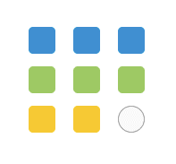
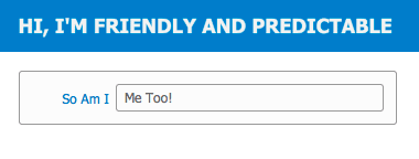
Different types of shapes can evoke different emotional reactions. Of the geometric shapes, we probably use rectangles and rounded rectangles the most. This makes them familiar, safe, and predictable. We often use them to present and organize information in a logical, clear way.
Circles are less common than rectangles, so they tend to stand out more. They have associations with infinity, completeness, and inclusiveness. You can use them as dots, bullet points, and badges. The circle implies movement from its association with the cyclical motion of the life cycle or a wheel. They can be portals (portholes?) into another world when you place an image inside a circle.

Triangles suggest action and movement, energy and revelation. The most common use of a triangle is as an arrow. Use them to point at something important, like a location indicator in navigation, to indicate motion, like a back/forward pointer, or disclosure, like a dropdown menu, collapsible list, or popover.
Natural shapes evoke emotion as well. We often see them on web pages, especially sites selling consumer products. They can have an aspirational quality (serenity, coolness, luxury, or comfort). Use natural shapes carefully, as it can pull focus away from the goals of the application (unless the application is an image database—then put the images front and centre!). Splash pages or menus, headers, or small areas of interest all work well with natural shapes. If you’re using a photo, consider blurring it if there will be text overtop, and make sure there’s enough contrast between the photo and text.
The emotions from abstract shapes come from their style, colour, and the (sometimes complex) ideas they symbolize. Users derive associations based on their interpretation of the meaning of the symbol or icon. To be effective, make sure the symbols you use have an agreed-upon meaning. You can search a site like The Noun Project to find symbols that match your idea.
6. Symbols
Symbols are invaluable to designers because of the way they condense meaning into a small, economical space. Letters are a kind of abstract shape (known as a glyph) that represent the sounds of words in writing, but there’s not always space to provide a written label. Symbols and icons convey a complex idea quickly in a single, efficient character. They become a language of their own.

Where space is at a premium, symbols pack a lot of meaning into an application—provided users understand what the symbol is meant to represent. Using little-known symbols can cause confusion. However, sometimes nothing seems to fit, and we need to “assign” a meaning in the context of the application. In these cases, be sure to educate users about what the symbol means, and use symbols consistently to mean the same thing everywhere.
You can find lots of sites specializing in icons sets and symbols. To be most effective, make sure they match or complement each other in visual style and colour palette. You could also make your own, using a font or icon set such as Pictos or Minicons.
7. Golden rectangle
A golden rectangle is a special kind of shape where the ratio between the length and width is 1:1.618. This ratio is known as the golden ratio. Used in art and architecture for thousands of years, it has special mathematical properties. If you remove a square section of a golden rectangle, what remains is another golden rectangle. You can go on removing square sections indefinitely, which results is a golden spiral.
 [Public domain], via Wikimedia Commons")
Closely related to the Fibonacci sequence, the golden ratio is seen often in growth patterns in nature, and even the proportions of the human body adhere to it. Objects that have golden proportions seem innately more beautiful to us. The real impact to software design is that content presented inside a golden rectangle is more easily understood than any other shape.
Books, computer screens, and iPhones are all rectangular because it’s a shape that aids understanding. Designing with the golden ratio can make your layouts more attractive and easier to understand. An easy way to apply it is to use the rule of thirds. Divide your layout into thirds, horizontally and vertically. Wherever the lines intersect will be a point of interest that draws the eye. See this tutorial to learn more about designing pages that adhere to the golden ratio.
8. Size
One way to change the impact of a shape is to alter its size. Larger shapes have more impact than smaller ones. All shapes don’t appear to have equal size, however, when placed side by side. This is because of optical size relationships between objects. A circle and triangle might be mathematically the same size as a square, but need to be made slightly larger to appear to be the same size on the page.
In typography, designers use optical alignment to make thin or curved letters (like “T” or “C”) look more aligned with the left edge. You won’t be able to control this in all situations, but knowing about it and fixing it in places where it’s very evident is a nice detail. Learn to trust your eye to make adjustments when necessary, don’t just blindly go by numeric measurements or the “snap to grid” feature.
—Kristin Cullen, Design Elements: Typography Fundamentals
9. White space
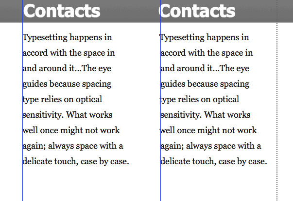
If shapes are positive, space is negative. Once you place an object in a space, you create a foreground and a background, both of which have a shape. You can’t change one without affecting the other. So whether you realize it or not, the negative space (“white space”) takes on a shape in your design.
When the objects are placed centrally and symmetrically, white space becomes passive, and seems to fade away. When the design is more asymmetrical, white space becomes active, its shape becomes more obvious and directional. Whether you want to create one effect or the other, the important thing is to make a conscious choice.
When you plan your design using a grid, white space takes on a structural role. As we saw with the golden ratio or rule of thirds, this can be a subtle but powerful tool. It lends familiarity, credibility, and trust to the different pages of an application. You can use a symmetrical or asymmetrical grid arrangement, with or without supporting lines or borders, to make more conscious use of white space.
10. Designing
Design is, among other things, the arrangement of shapes. Experiment by mentally setting aside the meaning of headlines, copy, visuals, and other elements and treat them as if they were purely form. —Alex White, The Elements of Graphic Design
If complex natural shapes are derived from simpler ones, the inverse is also true: you can break down complex shapes into simpler ones as well. Artists frequently do this when drawing from life, as in the example below:

But seriously— in early designs, reduce complex shapes like letterforms and icons to more basic geometric shapes. This lets you consider the design without getting too caught up in the details as you try out a number of different layout options. It’s easier and faster to just draw basic shapes instead of wasting time trying to represent the real content.
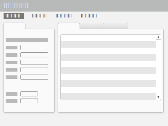
This can stop you—and perhaps your client—from feeling too “precious” about your initial ideas, when things are still flexible and changing. Early in the process, speed is important and it’s okay to have a bunch of boxes stand in for buttons or major section headings, working out the details later.
Conclusion
Using shapes carefully can add interest, aid understanding, and make a real difference to your designs. The organization, meaning, and emotions of your design are all affected by what shapes you choose to use.
How can you use shapes to support your design?
Hey Alexis.
I just found this post while looking for something completely different. It is very well written and explains several concepts of which I had heard but didn’t really grasp.
Belatedly
Thank you
JB
Thanks, John! I’m so glad it was helpful! —Alexis