

There are some details that, if left unattended, can detract from a good user experience. Learn about some things you can do to make your solution look more polished and professional.
*****************
What makes the difference between a good solution and a great one? Cool fonts, beautifully-rendered icons, and the latest new interface techniques? Those can make your app look cool, for sure. But I’d venture to say that…drumroll please…Consistency and attention to detail are even more important than nice graphics.
If users start noticing little inconsistencies, their good experience (and their trust in the application) starts to erode. Anything that makes it harder for them to move smoothly through the solution, makes them more aware of little design flaws instead of focusing on their goal. If your app was a vehicle, you want the user to feel that they’re driving down the freeway at top speed in a luxury sedan, not bumping down a rutted dirt road in an old jalopy.
Actually, I wanted to title this post “Details and Consistency Are the Keys to Creating a Polished Solution,” but that seemed too long. Still, paying attention to details, and being consistent really are very important.
It’s much easier if you know about these things as you’re working, rather than having to go back later and fix them. Here are five areas to focus on:
1. Object placement
- Consistent placement of buttons/controls from screen to screen. This means you need to figure out a navigation model in advance that will work across the entire solution. If you need to design one area differently from the rest, make sure there is a good, obvious rationale for doing so. Otherwise, you’ll leave users wondering why it’s different and what they’re supposed to do next.
- No jumping objects. Objects on different layouts that appear in a fixed position (like navigation buttons) should be placed in pixel-perfect position. That is, they shouldn’t appear to jump around when you’re clicking through from screen to screen. This has been made much easier since dynamic guides were introduced in FileMaker 12.
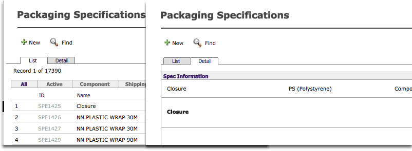
- List vs Form view. In FileMaker versions prior to 13, there was a 3-pixel offset between List and Form views, because of the record indicator. So, items in a List view that are meant to appear fixed when you switch to Form view should be placed 3 pixels to the left of their Form view position. (In other words, subtract 3 from the Left position coordinate of the object in Form view to get its List view position.) In FileMaker 13, the list indicator has changed by default to an alternate fill colour, rendering this offset unnecessary. If you want to get the old list indicator back, you can configure it in Layout Setup dialog.
2. Window behaviour
- Predictable window behaviour. New windows should open when and where the user is expecting them. This can get complicated, and different clients can have different views on how they’d like the windows to behave. Whatever you choose to do, apply it consistently. I often use a main file to store all the scripts and settings (such as window names and locations) and the menu interface, so all the window logic is as centralized as possible.
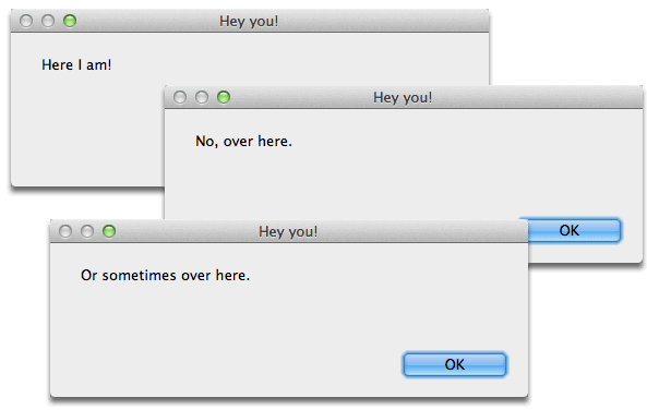
- Pop-up windows appear in consistent places. It just looks sloppy when pop-ups appear randomly located. The good news is that it’s a relatively easy fix, with some careful scripting. Here’s a great article from Digital Fusion about how to write a script that will consistently place pop-up windows where you want them.
3. Visual design
- Careful placement of objects. See if whitespace is evenly distributed around the object and its surrounding objects. Look above, below, to the right and left of the object. Is it a consistent distance from its neighbours or the edges of the layout? If not, there should be a good reason why. Users assume that objects that are closely grouped are related in some way. If one is set apart, it implies that the object is somehow different from the others.
- Object grouping. If objects are in a row or group, they should be the same size, aligned with one another, and the space evenly distributed between (or no space between). Their purpose for being grouped should be obvious (“Ah, these are all navigation buttons!”).
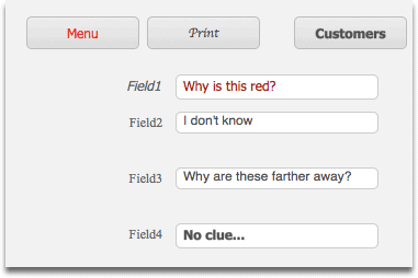
- Object colour. Objects that are grouped together and which have a similar function (like a row of buttons) should probably all be the same colour, unless there is a valid design reason. Use colour sparingly, otherwise it starts to work against you. If you use colour, make sure it means something, and stick to the meaning throughout. So, navigation buttons change colour to give the user clues to where they are, or date fields in red mean “LATE.” No “angry fruit salad.”
- Fonts. Consistent use of fonts and colour scheme for field data, labels, and buttons. Fonts and colours mean something within the context of an application. They give the user hints about what an object is for. Make sure you apply these rules consistently so that the differences between buttons, fields, and other objects is clear throughout the solution. Themes make this a lot easier, since everything is designed to go together.
4. Conceptual
- Hierarchy/naming. The way you name objects should follow a conceptual model that makes sense in the context of the application. Ideally, they should all be at the same level. So, that means they all have the same capitalization, pluralization and are the same word type (noun, verb, adjective). You can have an exception if you can’t avoid it and it makes sense, but that should be a choice, not an accident. For instance, the mobile Twitter app is divided into four sections: Timelines, Notifications, Messages, and Me. “Me” is the exception, but everything else is a plural noun describing what type of information the area contains.
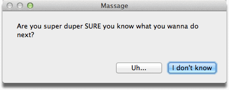
- Dialog boxes. Always write clear, concise instructions in dialog boxes. Make it easy to understand what the next action is. (Abort, Retry, Fail?)
- Spelling and grammar. Make sure all your text elements are spelled correctly and use correct grammar. Besides looking sloppy, typos can cause problems later, especially in field and function names where they can be difficult to spot.
5. Technical
- Naming conventions. It’s wise to figure out some naming conventions for fields, variables, and relationships. Also decide on how you’ll use capitalization, underscores, etc. There are a bunch of them out there. (Here’s a post from MightyData with a number of resources listed.) Which one you pick (or make up yourself) matters less than being internally consistent with applying it. Whatever conventions you choose, stick with them to reduce your own confusion later.
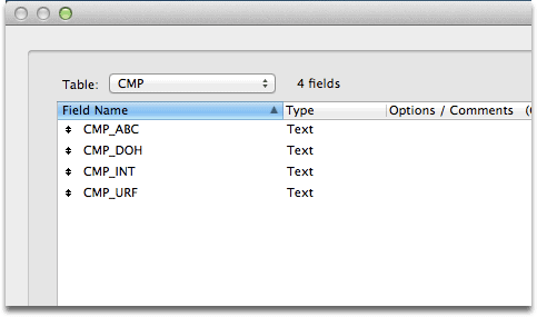
- Abbreviations. Personally, I avoid abbreviations except in cases where it’s unequivocally clear, and radically reduces the number of characters required. Otherwise it can be unnecessarily frustrating, especially after some time goes by and you forget what you meant by “CMP_INT.”
Consistent application of rules to the design of a solution dramatically increases its usability, and makes it more polished. Look after the little things, and you too can go from “good” to “great!”
Thanks for posting this. At this point I use these tips daily, but never thought to post them. It took a while to learn them and wish I had found something like this back when I started. In short very helpful.
Thank you!
Thank you Alexis, for pointing this out. I too, follow most of these rules, but have not yet put all of them down in a personal Developers Manual.
– I can now show this to one of my clients, who thinks his “angry fruit salad” actually looks nice. 🙁
I will read this again, before my next big project!
Good luck with that client!