
Part of a series on the basics of composing layouts to create appealing UI. Space is the basic element that designers work with. How we divide it up determines what we ultimately present to the user as our design.
Space: The final frontier… (Okay, that was bad.) But as designers, we are all “space explorers.” In fact, our main activity as designers is to “explore” the space on the screen by dividing it up in a way that helps users meet their goals.
As we move through an application’s windows, there’s a sense of existence in space, of “coming” and “going” somewhere. We use “forward” and “back” buttons to help find ourselves in the application. This journey happens only in our minds as we discover the various features and functions, but that doesn’t make it any less important.
Design is similar to art in that artists also divide up space, and guide the viewer’s eye, walking them through from place to place. Works of art tend to be more abstract, though, and their purpose more esoteric. Artists treat space in a great variety of ways, depending on the style.
We’re working on a more practical level, because design is really creative problem-solving. The problem with space is how to divide it up so that the purpose and functionality of the application comes through. As Alex White says in The Elements of Graphic Design, “The designer’s job is not to fill in all the space. It is to make information accessible and appealing.”
1. Flat plane
Unlike artists, application designers don’t use a lot of perspective in our work. Perspective is the optical illusion of some objects being in front of or behind other objects. We might create some depth by using a background, drop shadows or slight gradient on objects, or a photo, but we don’t usually draw true perspective.
In fact, we relate to the user on a flat screen, which consists of a single, two-dimensional plane. At one time, designers loved creating the illusion of lifelike objects, a form of design labeled “skeumorphism.” A new, flatter look is more popular now, however.
The good news is that “flat” (or now, “post-flat”) design makes our job simpler and easier. You don’t have to draw anything realistic to make a workable design. Basic geometric shapes, lines, and glyphs are all you really need to create a full-featured, usable app.
2. Application space
In FileMaker we’re dealing with a rectangular application space, the proportions of which are often based on the golden mean.
The golden mean or golden ratio is a mathematical concept describing a rectangle where the shorter side has a 1:1.61 ratio to the longer side. (Put another way, the longer side is roughly 1/3 larger than the shorter side.) Humans have used this proportion in various disciplines throughout history, including art and architecture. Closely related to the Fibonacci sequence, the ratio often appears in nature as well, in the growth patterns of shells, flower petals, even galaxies.

The proportions of the human body follow the golden ratio. Some studies even suggest that the golden ratio is built into our innate notions of beauty. The closer an object’s proportions to the golden mean, the more beautiful we find it, and the more brain activity associated with it.
Because of this seemingly ingrained preference, the human mind understands information presented in a “golden” rectangle more easily than any other shape. That’s why we have rectangular books containing rectangular blocks of text, rectangular computer screens and rectangular smartphones. In FileMaker, we further have rectangular fields, layouts, and windows. (They won’t all be golden rectangles, of course.)
There may be times we want to play with shapes other than rectangles, but presenting information in a golden rectangle makes it easier to absorb for most people. Dividing a layout in this way is also effective. It may sound boring, but it works!
3. Divisions and distribution
We add meaning to space only when we place objects within to contain or divide it. If we divide up the space into zones, then there should be an explicit or implicit purpose to each area. Users will assume that objects grouped together are conceptually related to one another.
As humans, we like objects to be evenly distributed throughout a space, giving us a feeling of openness and breathability. When we see too many elements squished together in one place, we get an uncomfortable feeling, and wonder why the available space hasn’t been used evenly. This distraction erodes our trust and takes away from the usability of the layout.
Users get a felt sense from the way an application uses its space. The way elements are laid out determines whether they get a sense of being open and safe, or crowded and hurried. When we place objects thoughtfully and carefully, it communicates to the user that we’ve thought the design through and provided everything they need. This is comforting and encouraging, and enhances usability.
4. Whitespace
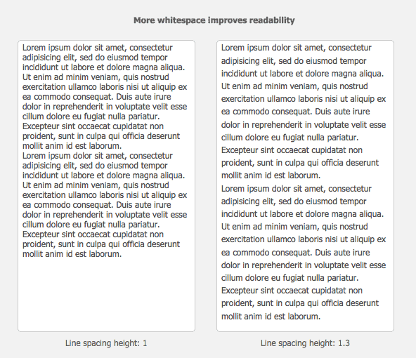
Objects need space around them to be distinguishable from other objects. For example, we need spaces between the lines so we can read the text.
Whitespace (or “negative space”) guides the eye like a map around the screen, inviting it to explore the objects it surrounds. It supports the hierarchy of a page by making more important elements stand out, and helps the user to navigate through the content, thereby making sense of it better.
Whitespace also gives the eye a rest, and provides a kind of rhythm and pacing for the layout. People become overwhelmed when presented with too much information. Less really is more.
Include more whitespace in your design to reduce visual “noise” and increase readability. It’s important to not only pay careful attention to what objects we place on the screen, but the spaces between objects we create as a result.
5. Background
The background is an integral part of the space of an application, since objects need somewhere to exist. Whenever you overlap objects in two dimensions, our brains assume that the one on top is closer, creating a sense of depth or perspective.
Soft or fuzzy focus can enhance this illusion as well (imagine a photograph—elements that are farther away are fuzzier than elements that are closer). Allude to depth to add interest to a layout with a minimum of visual load. A simple coloured or gradient background invokes a subtle sense of perspective; shadows cast on the background further enhance this effect.
You can use a very deep background in an area where individual items exist on top of it (think iPhone home screen icons over a background photo, for instance). Because each item has a single purpose, and has the same visual weight as its neighbours, it can hold its own on a busy background. On the other hand, the background shouldn’t have a strong focal point that could compete with the foreground.
You might use a shallower background as a backdrop to content-heavy areas. For maximum usability, content should always be in the foreground. Most fields exist on a solid area, usually on a white or off-white background. You can add interest by using a coloured or gradient background, combined with white or off-white content panels. The background can show through as divisions between the panels, and/or around the edges of the layout. Shadows should be subtle.
So-called “flat” design often uses a very shallow or almost no background. This style of design adds visual interest by using areas of colour instead of depth/perspective cues. In my opinion, it’s more difficult to do this well in complex applications. It can turn out seeming either directionless, or overly complicated. It takes practice to combine colours well. Keep in mind that reading text on a coloured background can be hard on the eyes.
6. Hot spots
Eye tracking is the path the eye follows when scanning a page. In any application, there are certain places people tend to look first. These are known as “hot spots.”
A famous eye-tracking study from Jakob Nielsen shows that users read web pages in an F-shaped pattern. Starting in the upper left, readers scan first almost all the way across the top. Next they look down the left side a bit, then across the page, but not all the way across. Finally, they scan a bit further down the left side. There are variations but this is the rough pattern most people follow. In cultures where text is read from right to left, the pattern is reversed, and readers look more at the right side of the page.
In his book Web Form Design, author Luke Wroblewski tells us that for a usable web form, people need a clear “scan line.” That is, they need to see a single path through the form, from beginning to end. This will also favour the left side of the page.
Whether web forms, or (more complex) FileMaker layouts, this tells us that the most important information is best placed along the top and/or the left side. Elements that help the user make sense of the hierarchy of the application are best placed in those locations. If you look through your desktop applications, you’ll see that most software is designed this way.
Anything that has visual weight will attract the user’s attention. Make sure that the important elements stand out, and are in the places that users look first. Ask yourself if the space is designed so that it visually supports the underlying hierarchy.
7. Constraints
Every application has space constraints, but we notice it the most on mobile devices. Designing for a smaller space is more challenging than for a larger screen, for obvious reasons. How do you fit everything in? Should you even try to?
To refer to Luke Wroblewski again, in his book Mobile First, he makes the case that designing for mobile strips away all the “fluff” of a desktop application. This can have the effect of creating a laser-like focus on task completion. As he puts it, “There simply isn’t room for any interface debris or content of questionable value. You need to know what matters most.”
The hot spot eye tracking I mentioned above is less relevant on mobile devices. The user’s hand—and often just their thumb—is their interaction device on a touch screen. It becomes very important to place the controls so they can be accessed easily, and to include fewer elements on each layout. You may have more layouts as a result of being able to fit fewer interface elements on each one.
Buttons need to be relatively large and spaced out, and placed around the edges of the screen—especially the bottom. Check out this article from the Google Mobile Ads blog on the ideal size and placement of buttons on mobile apps. Designing with constraints means including only the most important items, and placing them in the most important locations.
8. Context
Spatial awareness is derived from context. We use clues in the environment to locate ourselves in space, whether that space is real or virtual. So the designer must arrange the space so that the clues pointing in the right direction are obvious. The purpose and structure of each layout should be clear to the user, because the more easily a user can understand the larger context, the more effective the application.
Context awareness is linked to wayfinding. (What am I doing here? Where do I want to go next?) Exploring different areas is like going through rooms in a house; people create mental maps that store the structure so they can easily move around from place to place. If users get lost, they won’t achieve their goal.
To find their way successfully through the application space, users need a logical path to follow leading from one task or area to the next. They need to be able to distinguish one screen from another, understand the purpose of that screen, and be able to get back to where they started without losing their way. (Read about how to create a progress tracker in FileMaker.)
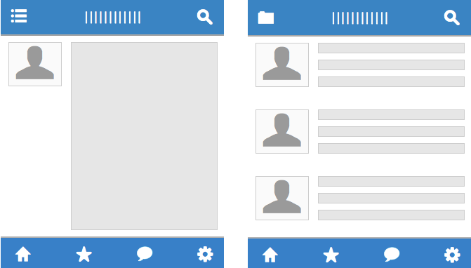
9. Consistency
Your application will be more usable when the layout space is uniformly arranged from screen to screen. A consistent use of space establishes the hierarchy, helps users navigate, and ties together areas that are different from one another. When a user first encounters an app, they must learn how it works, and how to get their task done. This learning process should be as easy as you can make it.
Consistency is important because it makes your app more predictable, and therefore easier to use. When users can count on consistent placement of buttons, navigation elements, and so on, they don’t have to relearn each new layout. Learnability is a key factor in usability, and consistency enhances the learnability of an application.
Consistency will help you in executing the design as well. You’ll know where each element goes in advance, and won’t have to make a lot of decisions about where to place objects on each new layout.
A consistent design shows you’ve thought through the whole application, and have left space for each element that needs to be included. This is reassuring and fosters a sense of trust, since the user won’t land on a page that doesn’t fit in, wondering why everything is suddenly different.
More than any other factor, consistency affects the perceived quality and dependability of any software you create.
10. Economy
“A designer knows he has achieved perfection not when there is nothing left to add, but when there is nothing left to take away.” -Antoine de Saint-Exupery.
This famous saying reminds us that a designer’s main job is to figure out how little we can include without confusing users.
Gone are the days when we might throw everything and the kitchen sink at a layout. As one of your later design activities, try to remove as many extra elements as you can. This opens up the space, giving more room for the important elements to stand out. Like the “mobile first” ethic, the goal should be to evaluate every element and strip away anything unnecessary.
Another famous saying, attributed to Albert Einstein (although this is possibly disputed) goes, “Everything should be made as simple as possible, but no simpler.” In other words, all other things being equal, you’re better off choosing a simpler approach over a more complex one.
This is true in design as well. A simpler design will be easier to use than a more complicated one. But creating a simple design may not be easy. It requires trade-offs and problem solving along the way. The difficulty of delivering complex functionality with a minimum of complex visuals is the job of every good application design.
Conclusion
Every solution is defined by its use of space. The designer’s job is to make sense of the space so that the user can achieve their goals as easily as possible. The way you use space throughout your layouts not only physically allows a user to interact with the application—the use of space connects one area to another, and creates a visual flow that eases understanding and helps guide the user through completing their process. It is an expression of the design come to life. The more consistently you can do this, the more effective it will be.
How can you arrange the space in your designs to create flow and better help your users?