
Most FileMaker forms work. But the best ones feel effortless to use. If you struggle with FileMaker form design that feels cluttered or clunky, these six best practices will help you design cleaner, more efficient, and user-friendly forms.
As a developer, you probably encounter FileMaker form design all the time. After all, forms are the primary way data is entered into a FileMaker table. That makes it essential to structure your forms in a way that allows users to enter information as clearly and efficiently as possible.
Most form design advice you’ll find online is focused on Web forms. On the Web, forms are typically presented to anonymous users for specific, targeted purposes, such as registration, payment, or some other conversion goal.
FileMaker forms, on the other hand, are usually completed by known users who have defined (and often complex) roles within an organization.
As a result, FileMaker form design can be a bit different from Web form design. For example, you’re probably not as worried about people abandoning the form halfway through, but you do need to invest more effort in organizing the contents of the form to support accurate, reliable data entry.
Another key difference is that FileMaker forms tend to be more complex and less standardized than their Web counterparts. FileMaker forms often support highly customized, multi-step workflows, dense information, or role-specific inputs.
That means that some common Web best practices don’t always apply (such as only presenting fields in a single column), especially when screen space is limited.
That said, we can draw on the large body of research about how people interact with Web forms to inform our FileMaker form UI design, especially when it comes to how users process information and respond to visual cues.
For example, studies show that:
- Clear labels and consistent field alignment help users complete forms faster and with fewer mistakes.
- Grouping related fields visually and logically improves comprehension and reduces cognitive load.
- Reducing the total number of visible fields increases user satisfaction.
While not every Web best practice translates directly, these insights about human behaviour, attention, and form usability are still highly relevant.
With that in mind, here are some of the most important things to consider when designing FileMaker forms:
1. Begin with a Content Inventory
Before you start arranging fields or thinking about the form’s UI design, take some time to identify what fields actually need to go on the form. Think about the user’s task or goal. What information do they actually need to see or enter in order to complete the form efficiently and without confusion?
In general, people find it easier to complete shorter forms accurately. That means it’s worth questioning every field: Is it truly essential for the task at hand? You want to avoid overloading the screen with information that isn’t necessary in the current context. Removing even a few non-essential fields can make a form feel more approachable and reduce cognitive load.
If you have a form with lots of fields, it’s usually better to break it into multiple tabs (or a step-by-step wizard) than to create one giant form that can seem overwhelming.
On the other hand, breaking the form into multiple screens or tabs adds clicks that could annoy users that are used to seeing all relevant fields at a glance. When designing longer forms, you’re trying to strike the right balance between simplicity and accessibility.
That starts with knowing what truly needs to be there, and leaving out what doesn’t.
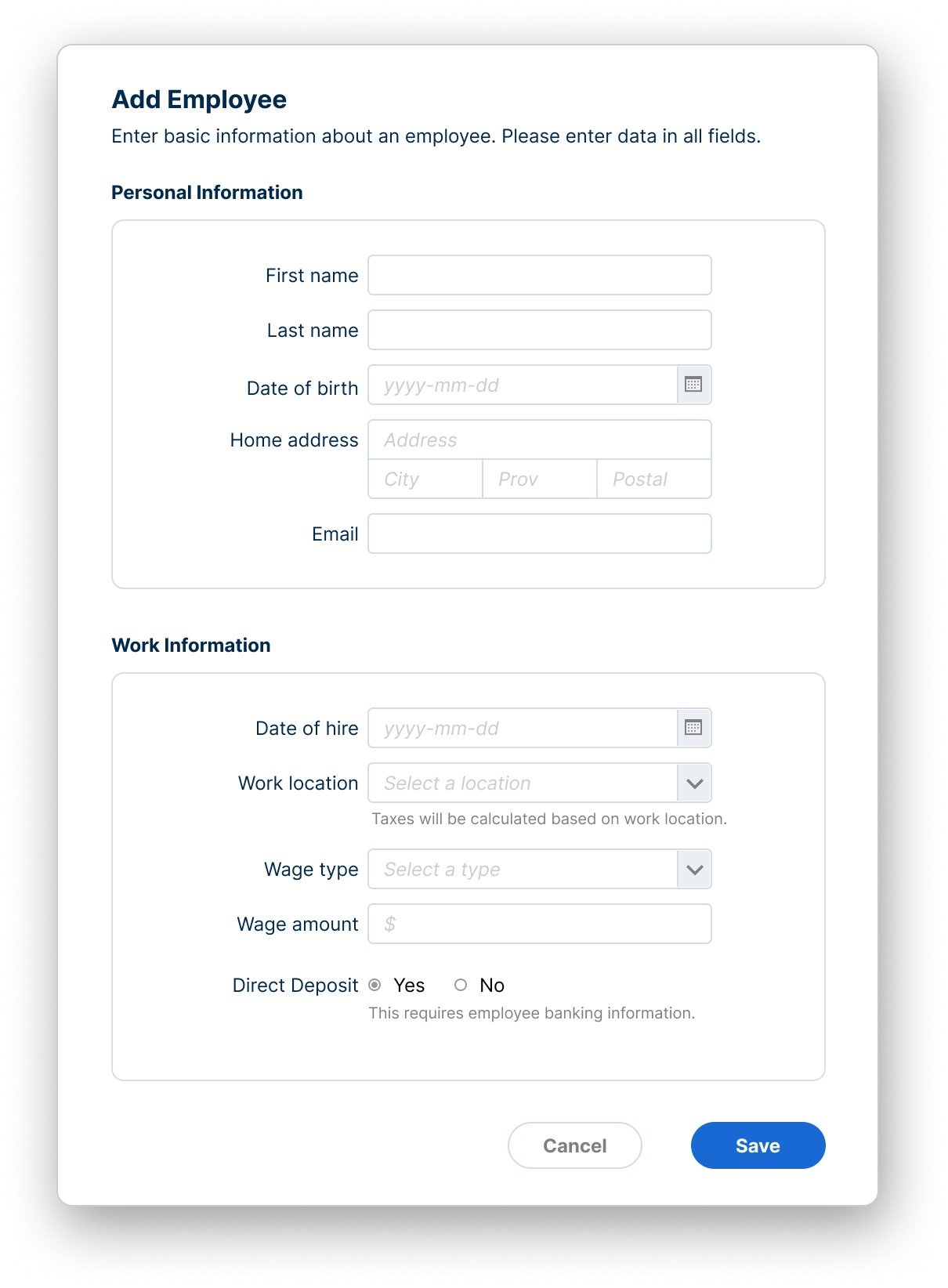
2. Categorize & Group Related Fields Together
Once you know the content of the form, you’re ready to start organizing and categorizing it. A good practice is to group logically related fields into clearly labeled sections, using visual hierarchy and whitespace to reduce clutter. This helps users feel in control without being overwhelmed.
The practice of organizing, arranging, and labeling content in a way that supports clarity and ease of use is known as information architecture (IA).
In the context of FileMaker form design, IA provides a framework for deciding which fields belong together, what order they should appear in, and how each section should be labeled to guide the user’s attention. Good IA makes the form feel intuitive by helping users find what they need without hesitation.
For example, you might group all contact fields such as phone, email, and department into a single “Contact Info” section, rather than scattering them throughout the layout.
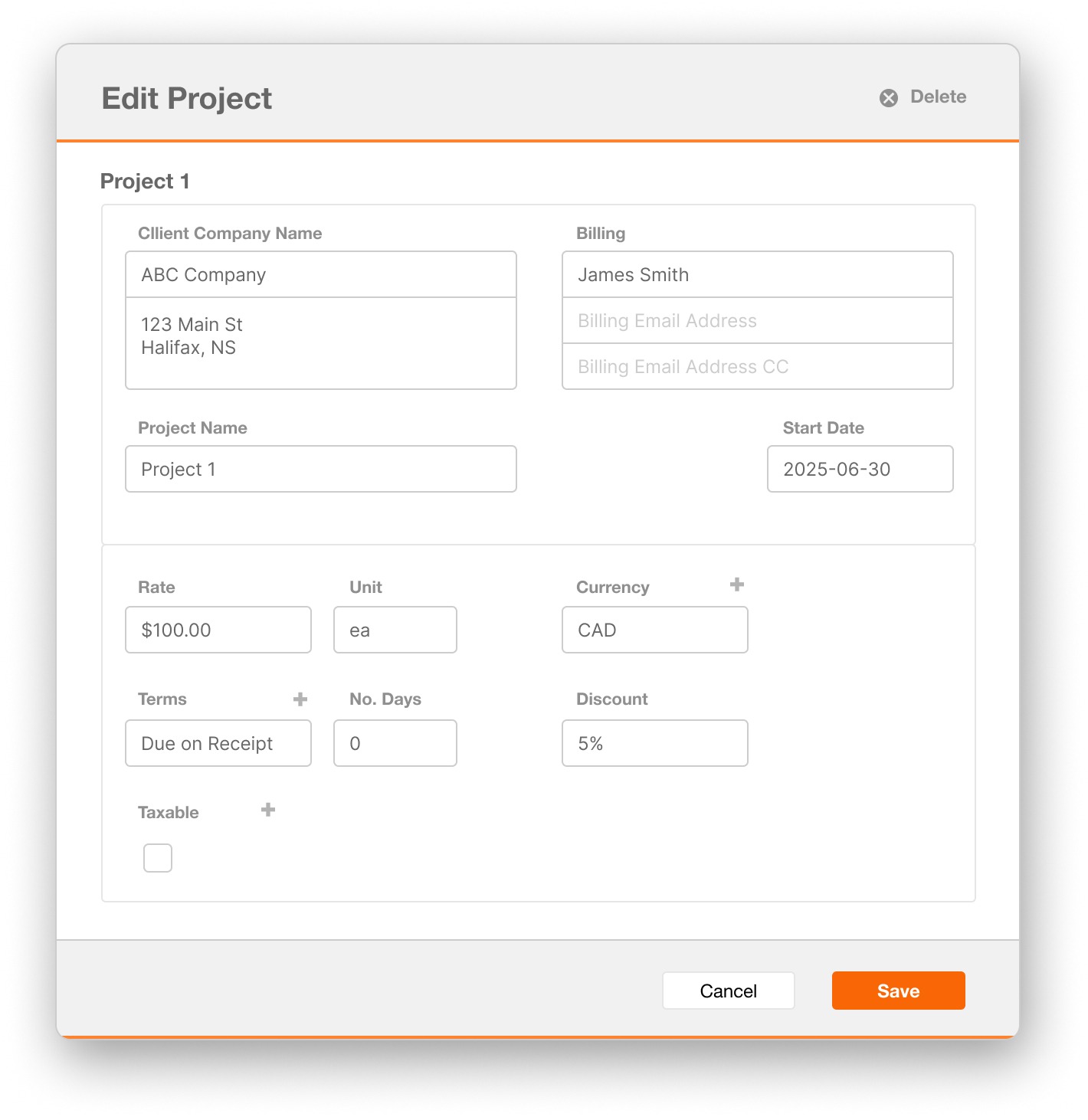
Or, as in the Edit Project form example below, client and billing information is subtly separated from the financial details. Grouping fields by function helps users focus on one category at a time and makes the layout easier to scan and understand.
3. Sequence Fields Logically
Think about the logical flow of the information in the form, and stick to any pre-existing conventions. For example, you should present address information in the standard order: Street Address, City, Province or State, and Postal or Zip Code. This kind of familiar sequencing reduces friction and helps people complete the form more easily.
Also consider the complexity of the information being gathered. In general, you’ll want to start with simpler or more straightforward information before moving into details that may require more thought or precision.
For instance, it’s better to collect basic project data before asking users to select complex billing terms or assign team roles. This gradual increase in complexity helps users build momentum and feel more confident as they move through the form.
4. Decide on Label Placement
Where to place field labels is a question that comes up over and over again.
The fact is that there’s no one definitive answer. Each approach has its own advantages and disadvantages, and understanding them can help you choose the right approach for your specific form.
Let’s take a look at each approach in detail:
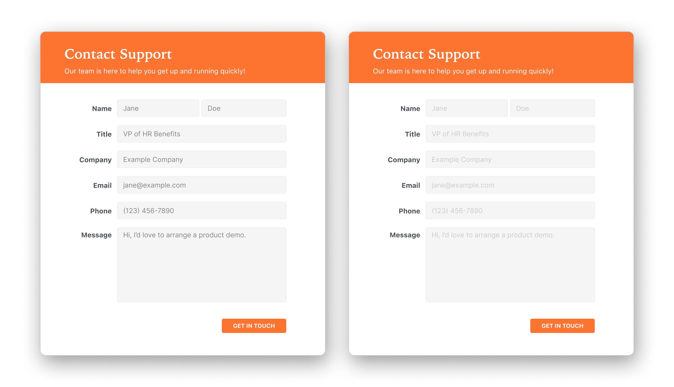
Above the field
The general consensus across the Web is that labels placed above form fields (especially when arranged in a single-column layout) results in the fastest, most accurate form completion. This arrangement is especially useful on mobile, where there’s not much width to work with.
Top-aligning the labels in this way creates a clean left edge, so it’s easy for the eye to move from one field to another after completing it, without jumping back and forth between the labels and fields.
On e-commerce websites, form speed matters because users are more likely to be unfamiliar with a specific form, and abandonment is a major concern. So people’s ability to relate the labels and fields quickly and accurately tends to be the top priority. Forms also tend to be short.
This isn’t as big of an issue with internal apps, because users often fill out the same forms repeatedly as part of their jobs. So they’ll usually be more familiar with any given form, at least after the first few times they interact with it.
Top-aligning labels can also accommodate different lengths of labels. This can be especially useful in a multi-language solution, where the translated labels could be significantly longer than the originals. Placing the labels above the fields ensures that any longer labels won’t wrap or run out of space.
The biggest disadvantage to top-aligning labels is that it makes the form twice as long. This can make an already complex form feel even more overwhelming to complete. And since app forms often need to collect a lot of data, managing the screen space becomes an even greater concern.
To compensate for the length, you could allow the screen to scroll, but then again, you may not want to use top-aligned labels if form length is an issue.
Top-aligning labels also makes it slightly harder for people to scan just the labels, since they appear in the same column as the fields.
Beside the field
The other possibility (at least in left-to-right languages) is to place the labels to the left of the fields. The main advantage to this approach is that it conserves vertical space, resulting in a shorter form. This is typically a key consideration when it comes to FileMaker form design.
If you do decide to place the labels to the left of the field, the next question is whether to left- or right-align them.
Left-aligned
Left-aligning the labels creates an easily scannable left edge, which helps people better understand and orient themselves in a long or complex form.
However, it also creates a visual gap between the labels and their corresponding fields. If you happen to have a particularly long label, this creates an even larger gap and makes it harder to relate the labels to their correct fields.
One way to reduce the gap is to allow longer labels to wrap onto a second line. However, this creates a visual imbalance in the regular spacing of the labels.
You can mitigate this by increasing the vertical space between rows to clearly separate each label-field pair, though this may make the form longer. Alternatively, you could add a separator between groups of fields to visually reinforce their relationship while minimizing additional vertical space.
Studies have shown that forms with left-aligned labels take the longest to complete.
However, in a complex business app that requires accurate information, this might not necessarily be a bad thing. You may actually want people to slow down and take a bit more time, to prevent them from introducing data errors that could have costly down-stream effects.
That said, once people are familiar with a form, they tend to complete it more quickly, so ultimately this slowdown might not have a very large impact overall.
Right-aligned
You could also choose to place the labels beside the fields, but right-align them.
This fixes the problem of a large gap between the label and the field, since the labels are closer to the inputs. However, it creates a ragged left edge, which makes it a bit harder to scan the labels.
Think about most of the text you read, whether in books, magazines, or even this article. In Western languages, nearly all text is left-aligned. Right-aligning labels breaks this familiar convention and forces the eye to move back and forth to locate the start of each label.
This preference for a clean, aligned left edge also makes wrapped labels harder to read when they are right-aligned, since the second line no longer starts in a consistent position.
Research shows that right-aligned labels can produce the fastest completion times when the labels are short and consistent in length. In these cases, the close proximity between label and field makes it easier to scan, and reduces eye movement.
For short, simple forms with uniform labels, this approach can be both efficient and effective.
The bottom line on label placement…
There’s no single “best” label placement. Each option has tradeoffs that depend on the form’s complexity, the amount of available space, and how familiar users are with the layout.
Top-aligned labels support speed and flexibility, especially in mobile or multilingual scenarios, but increase the form’s length.
Left-aligned labels support scanning and structure in longer forms, though they slow completion time. I personally find this approach the most adaptable for a wide range of scenarios in FileMaker form design, particularly when working with complex internal apps.
Right-aligned labels offer the fastest interaction when labels are short and consistent, but are harder to scan when they vary in length.
The key is to understand the purpose of the form, the environment in which it will be used, and the needs of the people filling it out.
5. Use Placeholder Text to Support, Not Replace, Labels
It can be tempting to avoid the argument of label placement altogether, and simply use placeholder text inside the field instead. It’s certainly very efficient with space!
However, it’s not a good idea to rely on placeholder text alone. Once the field is filled with data, the placeholder text disappears, and along with it, any clues identifying the field.
Separate labels are essential to help people understand the form, and allow them to double-check that they’ve entered the correct information before they commit or save it.
What you can do is use placeholder text to model the data in the correct format. For example, you might show a placeholder like “MM/DD/YYYY” in a date field, or “(555) 123-4567” in a phone number field to indicate the expected formatting.
Beware of making placeholder text too dark. People might think that it’s data and that the field has already been filled in. Remember that attention is drawn by a completely empty field. So when in doubt, leave it out.
Making placeholder data too dark can make it look like data.
Labels, not placeholder text, should be the main identifier for form fields.
You can use placeholder text to give helpful cues or formatting examples, but don’t expect it to do the job of a proper label. When used thoughtfully, it can guide users without getting in their way.
6. Consider Marking Required and Optional Fields
The standard convention is to place an asterisk (*) at the end of the field label to indicate any required fields. This works well when a form has a balanced mix of required and optional fields, and users need a quick way to distinguish between them.
However, if most of your fields are required, it can be better to mark only the optional ones instead. In this case, consider adding “(Optional)” in the field label or as placeholder text, so it’s immediately clear which fields can be skipped.
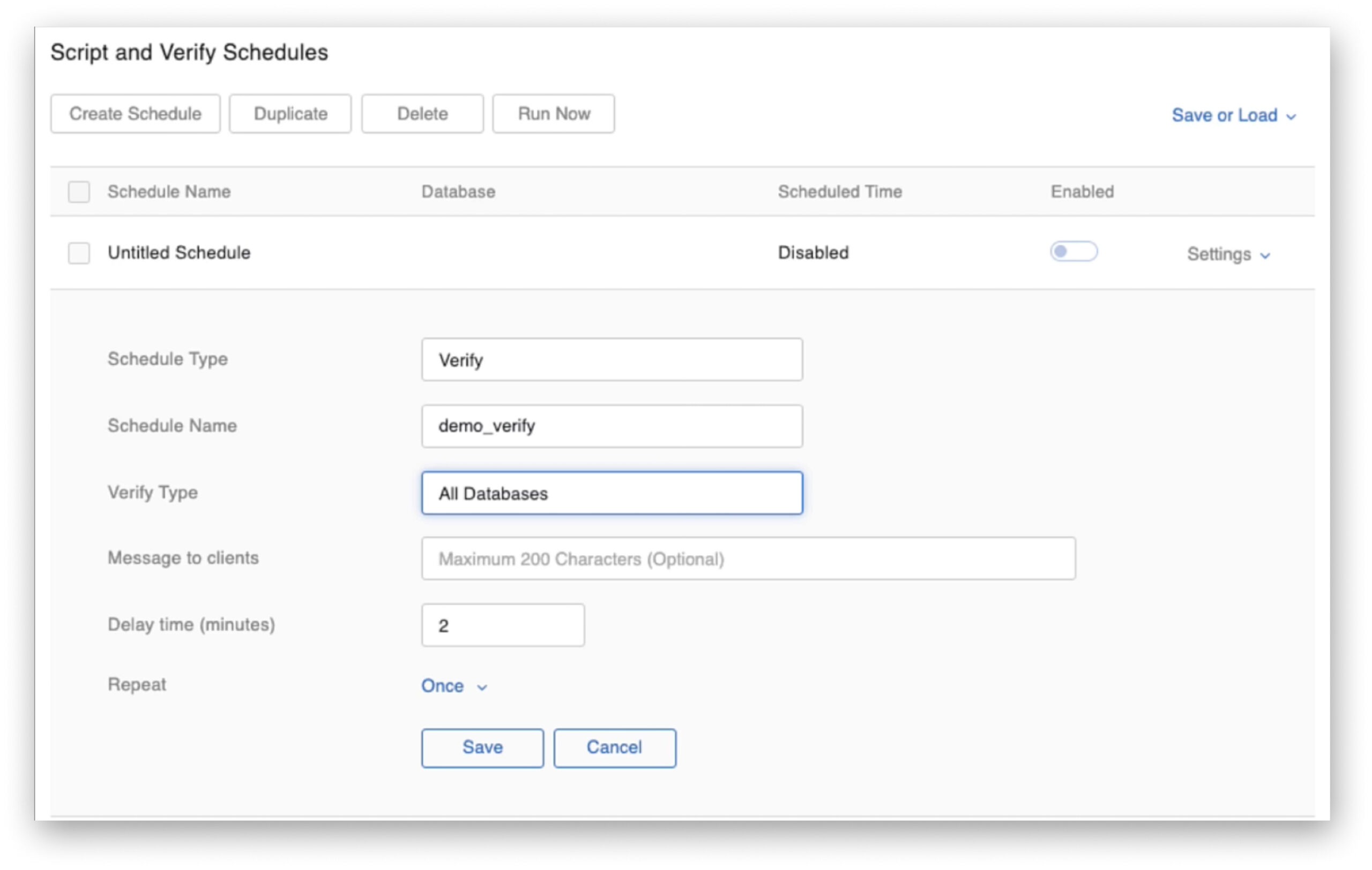
FileMaker Server Script Schedules uses the word “(Optional)” in placeholder text to indicate optional form fields
In internal apps, there are also times when marking fields isn’t necessary.
For example, if users are familiar with the form or if the context makes it obvious which fields are required, adding qualifiers might just add clutter.
You might also choose not to mark optional fields at all if your goal is to gently encourage users to complete as many fields as possible, even if some aren’t strictly required.
The key is to avoid surprises. Whether you mark required fields, optional ones, or both, your goal is to help users understand what’s expected.
Final Thoughts
Effective FileMaker form design helps users work efficiently, enter accurate data, and feel confident in the process. Each decision you make, from what to include to how you organize fields, place labels, and guide users with visual cues, shapes the overall experience of the form.
There is no universal formula. The best approach depends on your users, the workflow they follow, and the complexity of the data being entered. By applying thoughtful design principles and adapting research-backed practices to the FileMaker context, you can create forms that support real tasks with clarity and ease.
Well-designed forms reduce errors, increase user satisfaction, and make ongoing maintenance more manageable for developers.
Further Reading
Web Application Form Design by Luke Wroblewski
Interaction Design Foundation: How to Design UI Forms
The Definitive Guide to Form Label Positioning by Jessica Enders