
Previously, I wrote about how to convert your solution away from the Classic theme. In this part, I discuss five changes you might want to make while updating your FileMaker solution. These interface features will add professionalism, usability, and—dare I say?— “glory” to your solutions.
*****************
Read Part 1
Now that you’ve decided to update your layouts to a modern theme in FileMaker, there are a few things you might want to do at the same time, that don’t require any major changes to your layouts. Since you’re already touching every layout in your solution, why not take advantage of some new features? It makes sense to get the most bang for your buck. Here are…drumroll please…Five Things That Will Improve Your Converted Interfaces (in no particular order):
1. Hidden Scroll Bars
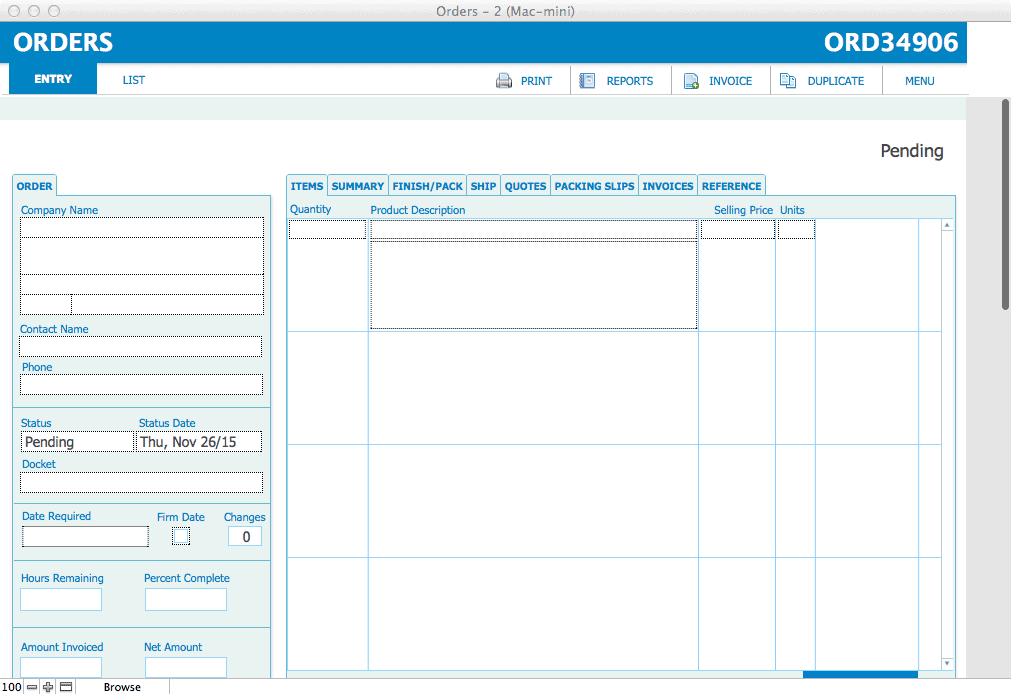
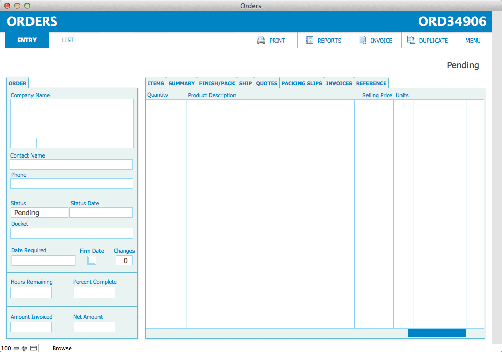
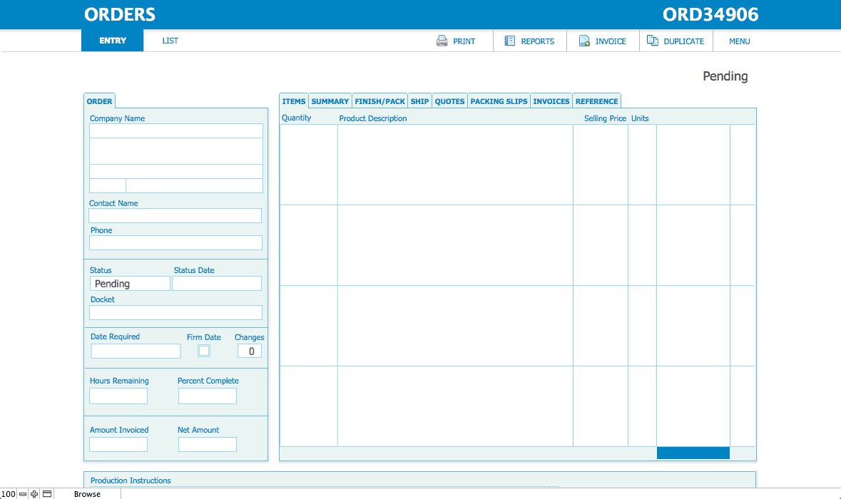
Readers of this blog know I like scrollbars! I’ve written about them before, probably because they can be one of the most distinctive elements of a layout, and in FileMaker there is very little about scrollbars that can be styled. So choosing the look of the scrollbars is a major portion of deciding on a new theme. And no other theme’s scrollbar is exactly like the Classic scrollbar style. So finding something to replace it with is a bit of a challenge. Here is the layout after switching from Classic to a custom theme based on Cool:
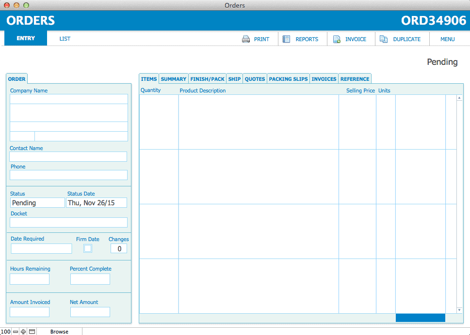
Well, instead of styling the scrollbar, how about hiding it altogether? This new feature is an option on fields and portals, and allows you to only show a scrollbar slider when the user’s cursor is actually scrolling. It’s the same way that scrolling works inside the FileMaker window itself—you only see a scrollbar slider when you activate the scroll wheel or perform a scrolling gesture on the mouse. This is the standard way scrolling is done on the Mac, in fact.
Limitation: Make sure that users have scrolling capability on their mice, or this feature won’t work.
2. Button Bar
The button bar object is an awesome FileMaker feature! Buttons are one of the most complex objects to style, with all the different parts and states they can have. The button bar drastically cuts down on the number of objects you need to deal with across potentially many layouts, and can even be conditionally or dynamically populated if you want. (Here’s an article from Digital Fusion describing how to create an abstracted navigation system using the button bar object.)
Now, rather than managing a row of individual button objects when creating a navigation bar, for instance, you can use a button bar instead. A single object can take the place of five or six separate objects. Be sure to go through all the button bar parts and states and make sure they are set how you want—There are a lot of them and the format painter transfers hardly any styles from a button object to a button bar object. There may be inactive, in focus and hover states inherited from the theme that you probably will want to change to match the previous behaviour, so you’ll have to do some work setting up the first button bar.
You can also mix a button bar with a regular button. In these examples, the Menu button is its own button, placed beside the button bar.
Limitation: You can dynamically set a button label, but you can’t conditionally specify an icon. Also, all the buttons in the button bar get the same width, no matter how long or short their label might be. So you have to set the button width to accommodate the longest button label, including some white space on either side. This might mean that short labels (such as the “Print” button below) end up with more space than before. So make sure you are okay with buttons possibly being more spread out, and have the space for them if you switch out individual buttons for the button bar.
3. Top Navigation Part
The new top header navigation part keeps the most important objects (like primary navigation) accessible at the top, where users need it most. It helps prevent users from getting lost, and provides them a quick way of getting around with a minimum of window scrolling. Don’t forget to check the style for the top navigation part, it may have a fill or border that you may want to change or remove to match your layout.
Limitation: Any background colour you set for a top navigation part stretches across the whole layout, even the inactive part (seen when the user stretches the window to the right). However, when objects on it are anchored to the top and left, the body background colour ends at the edge of the active part of the layout. When you pull the body part down with the mouse, a gray (or default layout background-coloured) gap opens up between the top navigation and the body part.
You can mitigate this by anchoring objects in the header to stretch between the left and right edges of the window. Or, create a rectangle the exact size of your top navigation part and send it to the back, and then remove any background fill colour on the top navigation part. This way, your top navigation will appear to end at the edge of the layout when objects are anchored to the top left, just like the body part.
One final alternative is to anchor the body objects to the middle. In this case, the white body background fills the screen and no “inactive” colour is seen.
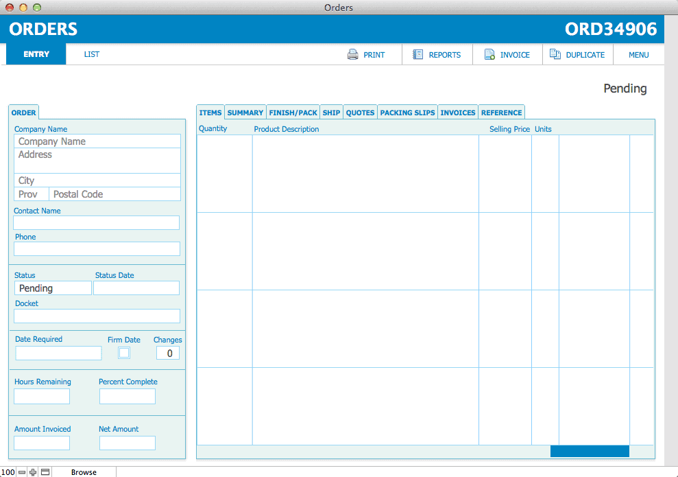
4. Placeholder Text
Who hasn’t wanted to dispense with field labels at times, especially on obvious fields, such as addresses? The user needs a text label to guide them when they’re entering data, but once a record has been filled out, it’s clear where the Street Name, City, Prov/State, and Zip Code should go. You don’t really need to devote layout space to them forever and ever. And yet, creating inline placeholder text has been too much work to maintain in the past, so I often didn’t bother with it, except when really necessary.
Now, placeholder text is an option on the field itself. You can have field descriptors show up inside an empty field without creating a separate text object. You can even set this text dynamically by calculation if you want.
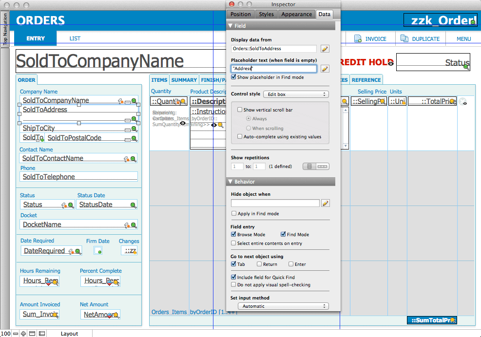
Placeholder text is also helpful in cases where you want to guide the user to a field, without cluttering the layout with field borders, which can be distracting when there is a lot of data. Placeholder text subtly cues the user to the text entry location, without disrupting the layout once all the data has been entered.
Limitation: Don’t do away with field labels completely. You’ll still likely need some field labels under certain circumstances, such as multiple phone numbers (e.g. home, office, mobile), or numerical data which needs to be identified to be understood.
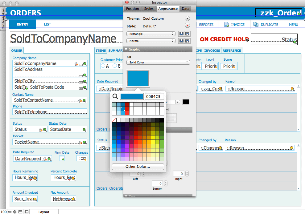
5. Custom Theme Colours
The colour palette is a super useful feature! You can drag a colour to the theme colours grid, located directly below the hex picker colour swatch. FileMaker will store the colour, and automatically create both a lighter and darker shade. This is a super easy way to create a range of hues to represent different button states (e.g. lighter on hover, darker when pressed) with literally the click of a button. You can reorder the colours by dragging the swatches around the colour grid.
Limitation: You can’t directly remove a colour from the colour grid. You can replace an existing colour by dragging a new colour onto it, or you can drag white onto it to “clear” it (although you’ll get gray as the top colour as a result).
Conclusion
Using or implementing one or more of these features will definitely improve your solutions and make them more usable and polished. Whether they’ll make them glorious or not—well, that will be up to you!
This is awesome!