
This post is about the progress tracker design pattern. A progress tracker is a user interface pattern that breaks down a multi-step process into parts in order to simplify it for the user. Buttons are easy to create in FileMaker, but what if you want a custom shape and don’t have Photoshop? Here are step-by-step instructions for how to build one for FileMaker Pro, including hover effects, using the online graphics tool Canva in combination with Preview on the Mac.
*****************
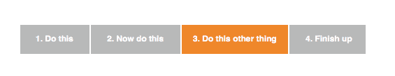
A progress tracker is a design pattern that helps users navigate through a complex, multi-step process. You’ve probably seen it used in web booking or checkout procedures. A progress tracker tells the user a number of useful things: how long the whole process is, what steps are required to complete it, where they currently are, and what is still left to fill in. Here’s an example of the finished product:

Skip directly to the tutorial
Design Pattern
A progress tracker improves your design because it gives the user important feedback about the size and scope of the task, especially if the task is relatively complicated. The user should be able to see the whole process laid out along the top of the screen, and it’s also helpful to number the steps for further reinforcement. Five or six steps is about the maximum that you’ll want to use, otherwise it starts to defeat the purpose. Three or four steps is ideal.
Sometimes users don’t have all the information they need to finish, or they need to stop the process because something else comes up, so there should be a way for them to cancel the process without losing everything they’ve done to that point. You should also provide a way for them to resume again later, as well as go back to earlier steps if they wish.
The easiest way to do this is to just allow them to navigate freely between the steps, provided that the only critical step is at the end (i.e. something happens at the end that you wouldn’t want to duplicate, like entering a payment, or performing a script that creates or permanently alters records.) If each step is dependent on the previous one (i.e. you can’t let them go to the next step until they have completed the earlier step, and they can’t go back), then you’ll have to track their progress and enforce rules more closely.
Finally, it’s wise to provide some kind of summary validation at the end, that lets the user know if they’ve left something critical out, and a link back to where they can input the missing information. Make sure they know what the final result is, and whether it was successful (“Payment successfully completed!” or “Timeline created!”).
That covers the general requirements for the progress tracker pattern itself, but this article is really about how to use Canva to create the interface buttons that guide the user through the process. This is assuming, of course, that you don’t have Photoshop and a library of already-created buttons at your disposal, and you want to create something a little more stylish and interactive than a series of plain ol’ FileMaker buttons.
Style
There are a number of ways you can design the visuals for this, the simplest being a series of text boxes along the top of the layout. It doesn’t have to be too complicated to be effective.
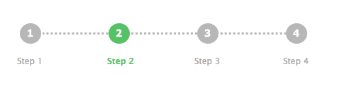
Or, you could get a little fancy and use a number line…
You also might be tempted to dispense with graphics and use a strictly text-based treatment using greater-than symbols as “arrows,” but this ends up looking like a breadcrumb pattern instead of a progress tracker.

I prefer not to use tabs for this, as tabs don’t provide the same clues of “you are here” that we need for tracking progress, and making sure the user understands they can’t skip steps.
To further reinforce the sense of directional progress, I decided I wanted to make my buttons higher-contrast, and to look more like arrows. I wanted an easy way to do this, without fussing too much drawing the shapes from scratch. I also wanted blank buttons, so that I could overlay my own text on top in FileMaker. Here’s the final product again:
Tools
Canva is a super-easy-to-use online graphic design tool. You can do a lot with their free graphics and some imagination, or you can choose from a selection of paid images or design elements, each $1.
There are limitations, and it’s primarily geared towards creating marketing images, but, with a little tweaking, I found it helpful for creating the progress tracker indicators. Certainly, you can find images elsewhere online (try a Google search for “free button”), or draw them yourself, as an alternative. The button style I used was free, and only requires creating an account.
You’ll also use Preview, which is already installed on the Mac.
Overview
First, you’ll create the graphics in Canva and save them to your computer. Next, you’ll open them in Preview and tweak them a bit, and save the different versions you’ll need. Last, you’ll insert the buttons into FileMaker, attach the scripts, and organize them on your layouts. Let’s go!
Steps
1. Create your graphic
On the Your Designs page of Canva, click “Use custom dimensions.” I used 300 x 300 but it doesn’t matter too much what you use, as long as the area is big enough for you to work with.
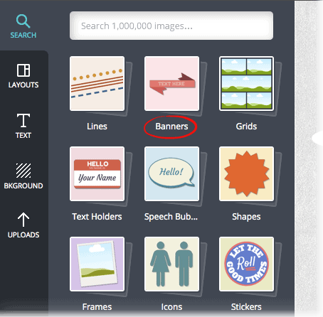
On the leftmost toolbar, Click “Search.” Click “Banners.”
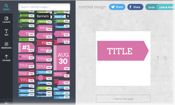
Scroll down until you see an area with pink buttons. Drag the button onto the canvas area.
Highlight and remove the text, then resize the button to the approximate height and width you want. If you’re unsure of the dimensions, I’d make it a little larger than you think you might need.

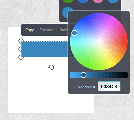
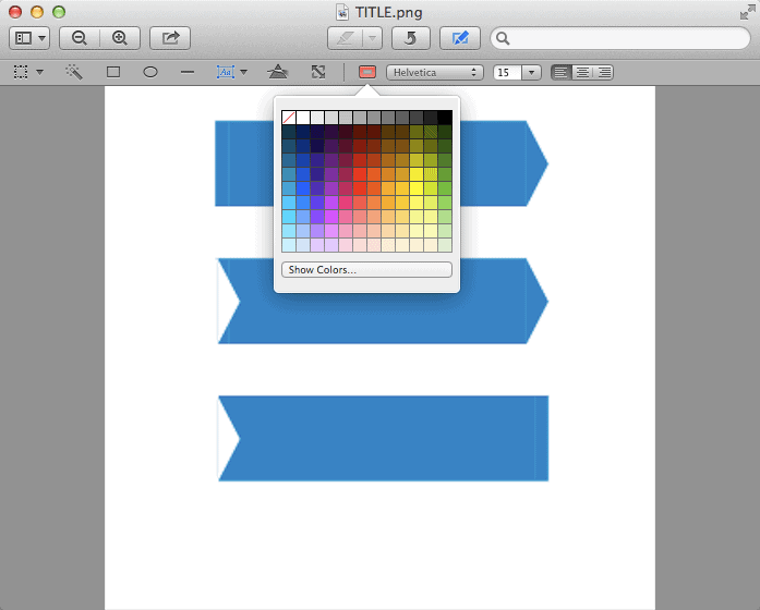
Change the colour (unless you want it pink) using the colour wheel or by entering a hexadecimal colour code. You can use the Mac utility Digital Color Sampler to hover over any object on your screen and pick up its hexadecimal value; make sure you select “Display Native Values” and View > Display Values > as Hexadecimal. Write down the R, G, and B values that appear after the “0x”, that’s your hex code. I used blue for this one.
If you’re not on Mac, here are some other colour sampling tools for different platforms.
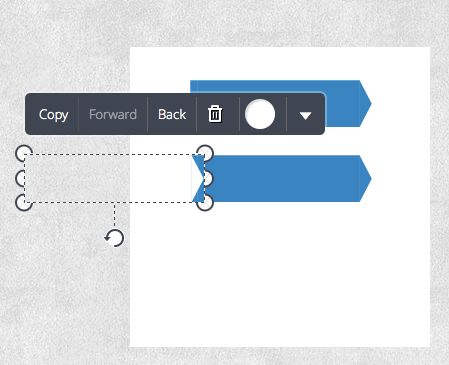
This button is good for the first step in our progress tracker, but we want the next steps to have the same shape cut out on the left side, so that the arrows visually nest into one another neatly.
Here’s how: Select and Copy the button you just created. Then copy it a second time. Select the second copy, change the colour to white, and drag it over the left edge of the first copy, lining the two buttons up carefully. This creates a nice, perfectly matched cut-out.
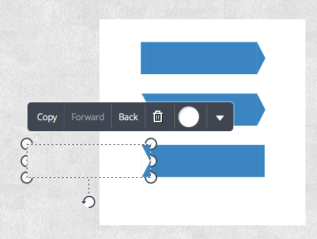
Finally, create the “end” button. This one will have a cut-out on the left and a straight right edge. Make another copy of the blue button. Using the rotation handle at the bottom, rotate the button 180 degrees, so that the flat end is now on the right instead of the left.
Copy the white button, and once again place it over the left edge of the blue button. The pointy part of the blue button will still be showing, so drag the left handle of the blue button to the left, to hide it under the white shape. (I highlighted the white shape here for clarity.)
At this point, save the buttons to your computer by clicking “Link and Publish” and then “Image” as the format (you’ll get a PNG file).

Then, still in Canva, select the blue buttons and change them to gray, and save the file to your computer again. These buttons will be to show the steps in their “non-active” state.

You should now have two files, one containing button graphics for the active state, and one containing button graphics for the inactive state. Unless you changed the title or button text, the files will likely be named TITLE.png and TITLE(1).png.
2. Tweak and crop the buttons
Open the first file in Preview. Now, you’ll need to do a bit of tweaking here, since the graphic as created from Canva has two one-pixel vertical, lighter lines in it, one at the beginning and one at the end. You could just live with them as-is, but I like to take a little extra care to make my graphics as nice as possible.
If you’re on Windows, you might try an image editor such as IrfanView with the IrfanPaint plugin.
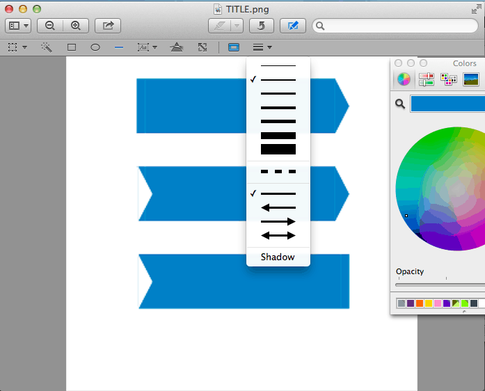
Click on the “Show edit toolbar” button (the pencil in a box). Then click the Text Tools (I know…bear with me here…). This will bring up some font options, including a colour selector just to the left of the Typeface name. Click “Show colors…” to get the Apple colour palette up.
Use the magnifying glass to select the button’s main blue colour. Select the line tool (see below). Zoom in so you can see what you’re doing. Draw over the light line with the line tool. You can use a slightly thicker line so you don’t have to be so precise. Do the same thing with the line on the left side. Make sure you avoid drawing right to the edge, destroying the anti-aliasing effect. (I also tried achieving the same effect by copying/pasting a rectangular selection of the blue colour, but I found that resizing the pasted colour was a little unpredictable.)
Select the magic wand tool, then click and drag across the blue part of the button to select it. (Maybe I’m dumb, but this took me a bit to figure out…just clicking doesn’t select anything, you have to click and drag.) Once it’s selected, copy it to the clipboard.
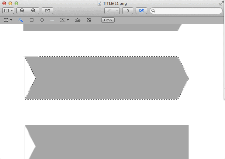
From the File menu, choose “New from Clipboard.” Then, save the file in PNG format. You did it!
Draw over the remaining lines in the other two buttons, and likewise save them. Save your changes and close the file. Open the file with the gray buttons and repeat.
3. Insert into FileMaker
Remember that the active button should be blue, the others gray with a blue hover effect. So you’ll be creating five separate button styles:
- A blue “active” button for the first step
- A gray button with a blue hover effect for middle, inactive steps
- A gray button with a blue hover effect for the last step (inactive)
- A blue “active” button for the last step
- A gray button with blue hover effect for the first step
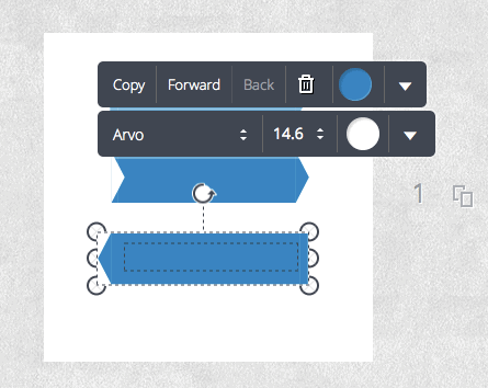
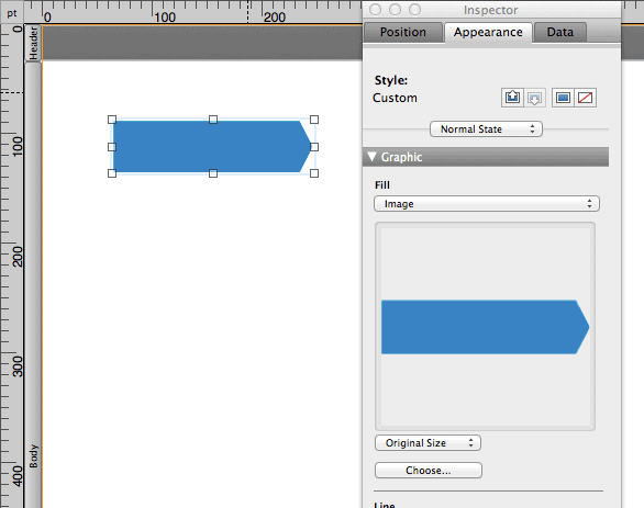
To begin, let’s create the first button, which is blue, with no hover effect. Start by creating a new button object. Make sure it’s a little larger than your button graphic. Select it. In the Graphic section of the Appearance tab in the Inspector, set the Line attribute to “None.” Under Fill, select “Image,” then “Choose.” Select your first blue button file. Adjust the object handles so that they are about the same size as the graphic.
Next, we’ll create the second button. This one will be gray, with a blue hover effect. Start by duplicating the first button. Select it and replace the blue graphic with the gray graphic that has the cutout on the left and an arrow on the right. Next, choose “Hover” under the Style section, then select the corresponding blue graphic for the Image fill.
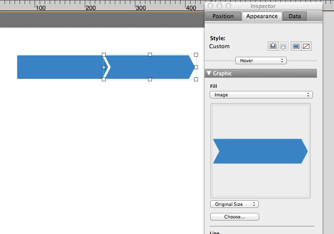
If you need to resize the buttons, you can choose “Scale to fit” instead of “Original Size” just under the image in the Fill options before you adjust the object handles.
All that’s left is to attach your scripts and arrange the buttons on the layouts themselves. Because the transparency is preserved, you can nest the buttons quite close together, and FileMaker respects the custom shape when you hover over the button (Update: I previously said “when the button is pressed,” but this was incorrect, sigh). It creates a nice, slick progress tracker.


Writing out all the instructions makes it seem long, but in reality creating the buttons should only take about half an hour or less, once you know the procedure.
I hope you enjoyed this tutorial! If you found it useful, let me know in the comments below.
Very cool Alexis … thanks for sharing this.
Thank you for reading, Vincenzo!
Hi Alexis,
very smart, thx for the greatly explanation.
Willi
Thank you!
Thanks for sharing this very nicely written guidance.
I’m glad people are finding it useful. Thanks for reading!
That was a really great tutorial, Alexis, and it was a lot of fun to discover Canva. Thank you!
Thanks Beatrice, I’ve been playing on there a lot lately! 🙂
Hi Alex – thank you for the description of your process and for taking the time to provide the details – much appreciated – Canva looks interesting and I look forward to experimenting with your approach – Cheers, Nick
Very cool, Alexis, clearly you pay attention to detail. Thanks for putting in so much effort!
Thanks Agnes!
Thanks for sharing this great article. Regards from Sunny Miami !
Thank you! This is exactly what I was looking for!!! Your instructions were very well written and I appreciated all the links to helper apps, too. Regards from Snowy Minnesota. (A bit jealous of the Howard, the previous reply) 😉
It’s also snowy here in Toronto.
Glad it was helpful, thanks for reading!